All Grown Up: The Evolution of the ChargeItSpot Logo

You may have noticed that ChargeItSpot has a new look. We’ve updated our logo and rolled out a new website and branding to boot. So what inspired this makeover? ChargeItSpot has grown up and it was time for our branding to grow up too. We’ve gone from a small start-up to an industry leader and now we have a logo that allows us to spread our wings. But before we get too much into the new stuff, we thought it would be fun to look at where we came from.
Logos of ChargeItSpot Past
Many (or not so many) moons ago ChargeItSpot looked like this…
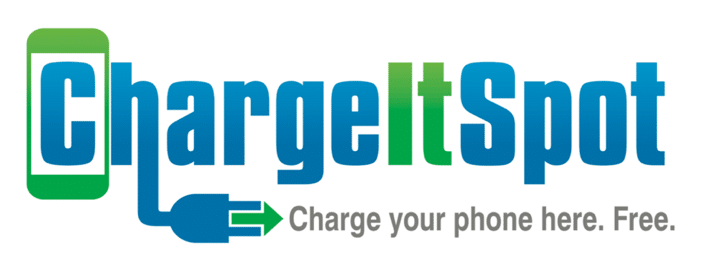
Our original logo followed in the footsteps of many great first logos, such as Apple’s and Starbucks’, telling the customer exactly what the company does. Everything from the image of the phone to the explicit “charge your phone here” leaves little doubt in the customer’s mind as to what ChargeItSpot is all about (hey, we charge phones!). This strategy was great for an early-stage startup trying to make a name for itself, but our company eventually outgrew this design.
Enter ChargeItSpot Logo 2.0
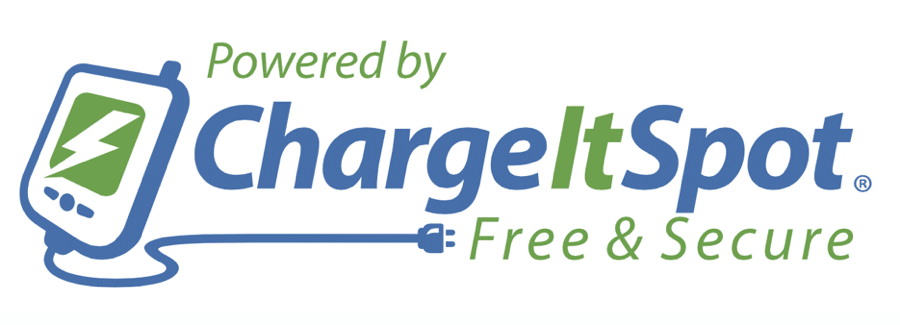
This is the logo that I’m sure many of you are familiar with. It has graced our charging stations for the past few years and is very near and dear to our hearts. The winner of an online contest (yep, that’s how this one was designed), this logo took the clarity of the previous design and dressed it up with a funky phone and more subdued color scheme. Logo 2.0 did a great job during the formative years of the company, back when we were just rolling out with our initial batch of clients. Now that we have added dozens of national clients and charged 2 million phones, it’s time for a refreshed image.
ChargeItSpot Today
Introducing…ChargeItSpot Refined

Tada!
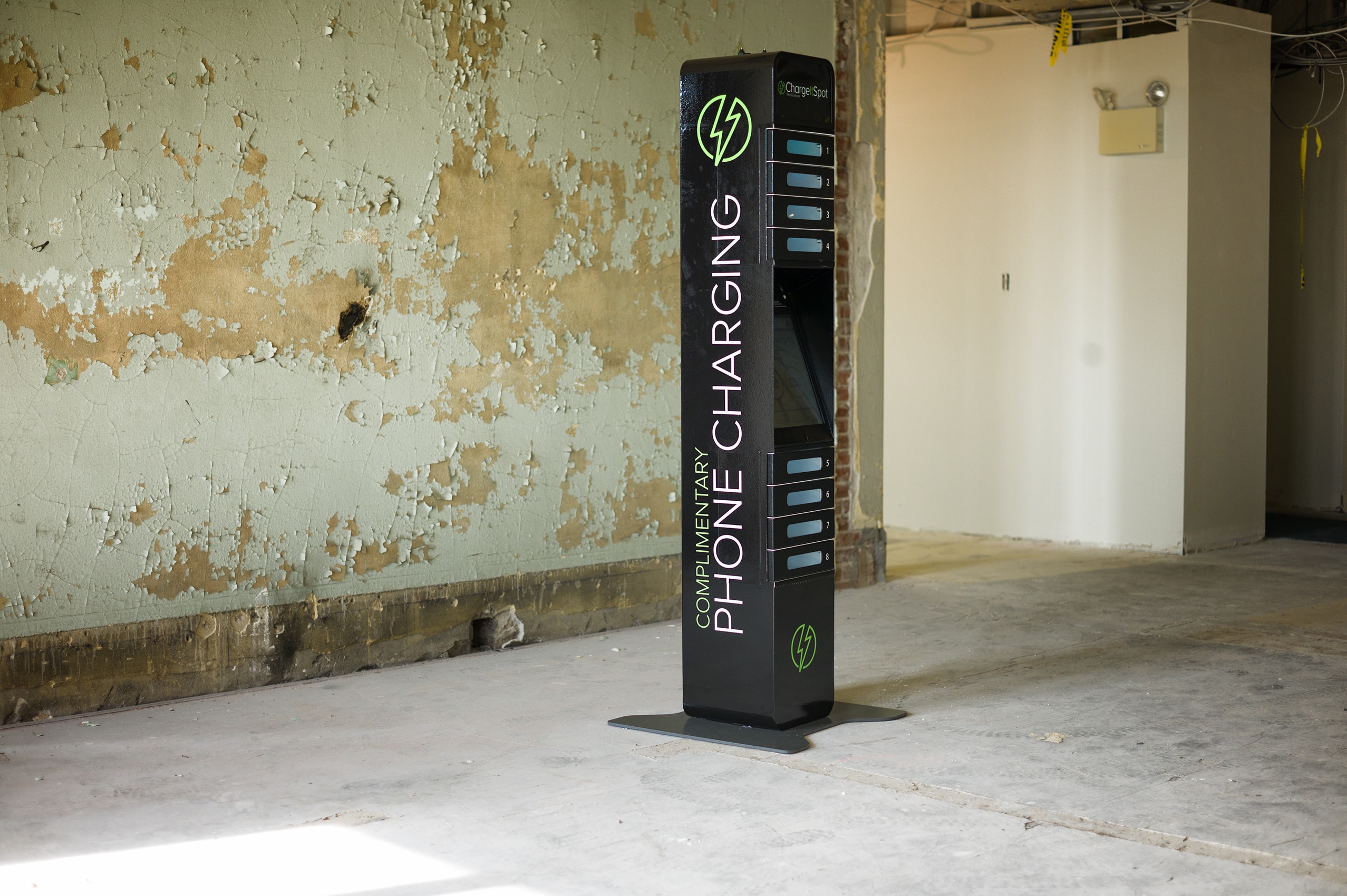
Our new look (shout out to our lead designer Nicole) conveys a brand that is modern, smart, and approachable. The rich colors represent our sophistication and the bolt represents Harry Potter! Just kidding. It has replaced the phone as a more modern, abstract icon for our company (think the Nike swoosh).
As a high-end technology company it is important that our logo reflects our quality and we think this one does the job beautifully. With brands like Neiman Marcus, Nordstrom, and Under Armour and events like the GRAMMYs, the Super Bowl, and New York Fashion Week attached to our name, we are proud to say that we have a logo that is as sophisticated as our clientele.
We are so excited about our new look and invite you to join us as we continue to grow. Keep an eye on us, there are big things in store for ChargeItSpot!
